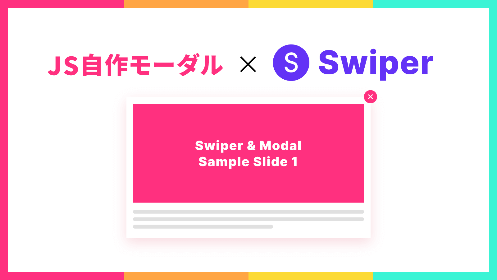
今回の記事では、モーダルとスライダーを組み合わせて使用する方法を紹介していきます。
ページ上のボタンをクリックするとモーダルが開き、その中にスライダーを設置するイメージです。
- モーダルは素のJavaScriptで自作
- スライダー部分はSwiperを使用
- ページ上のボタンをクリックするとモーダルを表示&該当スライドまで移動
このような機能を実装していきますので、モーダルでスライダーを表示したい方はぜひ参考にしてみてください。
JSモーダル&Swiperスライダーの実装DEMO
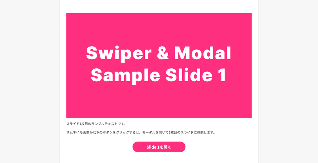
DEMOページを別で作成しましたので、まずは実際の動作をご確認ください。
- サムネイル画像かボタンをクリックするとモーダルが開き、指定したスライドまで移動
- モーダル右上の閉じるボタンかオーバーレイをクリックすると、モーダルを閉じる
- モーダル内のスライダーは矢印をクリック(PCのみ)、または横にドラッグするとスライド移動が可能
上記のような仕様になっています。
【コピペ用】JSモーダル&Swiperスライダーの実装コード
コピペするとすぐに使用できるコード一式を用意しましたので、自由にお使いください。
DEMOページとは見た目が異なりますが、基本的な機能は実装済みなので、スタイルやコンテンツは各自カスタマイズしてください。
<!DOCTYPE html>
<html lang="ja">
  <head>
    <meta charset="UTF-8" />
    <meta name="viewport" content="width=device-width, initial-scale=1.0" />
    <title>JS Modal & Swiper DEMO</title>
    <!-- Swiper CDN読み込み -->
    <link rel="stylesheet" href="https://unpkg.com/swiper@7/swiper-bundle.min.css" />
    <script src="https://unpkg.com/swiper@7/swiper-bundle.min.js"></script>
    <!-- CSS読み込み -->
    <link rel="stylesheet" href="style.css" />
  </head>
  <body>
    <!-- コンテンツ -->
    <div class="content">
      <button class="js-open-modal" data-slide-index="1">スライド1を開く</button>
      <button class="js-open-modal" data-slide-index="2">スライド2を開く</button>
      <button class="js-open-modal" data-slide-index="3">スライド3を開く</button>
      <button class="js-open-modal" data-slide-index="4">スライド4を開く</button>
    </div>

    <!-- モーダル -->
    <div class="modal" id="modal">
      <div class="modal__overlay js-close-modal"></div>
      <div class="modal__content">
        <button class="modal__close-btn js-close-modal" aria-label="閉じる">×</button>
        <!-- スライダー -->
        <div class="swiper modal__slider">
          <div class="swiper-wrapper">
            <div class="swiper-slide modal__slide">スライド1</div>
            <div class="swiper-slide modal__slide">スライド2</div>
            <div class="swiper-slide modal__slide">スライド3</div>
            <div class="swiper-slide modal__slide">スライド4</div>
          </div>
          <div class="swiper-button-prev"></div>
          <div class="swiper-button-next"></div>
        </div>
      </div>
    </div>

    <!-- JS読み込み -->
    <script src="script.js"></script>
  </body>
</html>
@charset "UTF-8";
/* 簡易リセットCSS */
*,
*::before,
*::after {
padding: 0;
margin: 0;
box-sizing: border-box;
}
/* モーダル */
.modal {
position: fixed;
top: 0;
left: 0;
width: 100%;
height: 100vh;
padding: 30px;
display: flex;
align-items: center;
justify-content: center;
transition: opacity 0.3s;
pointer-events: none;
opacity: 0;
z-index: 100;
background-color: rgba(120, 123, 131, 0.8);
}
/* モーダルがactiveの時 */
.modal.is-active {
opacity: 1;
pointer-events: auto;
}
/* モーダル背景のオーバーレイ部分 */
.modal__overlay {
position: absolute;
width: 100%;
height: 100%;
cursor: pointer;
}
/* モーダルのコンテンツ */
.modal__content {
position: relative;
background-color: #fff;
width: 100%;
max-width: 900px;
padding: 20px;
}
/* モーダルを閉じるボタン */
.modal__close-btn {
position: absolute;
right: 0;
top: 0;
width: 40px;
height: 40px;
background: #fff;
border: 1px solid #ccc;
cursor: pointer;
z-index: 10;
}
/* Swiperの矢印部分 */
@media (max-width: 768px) {
.modal .swiper-button-next,
.modal .swiper-button-prev {
display: none;
}
}
window.addEventListener("DOMContentLoaded", () => {
// モーダルを取得
const modal = document.getElementById("modal");
// モーダルを表示するボタンを全て取得
const openModalBtns = document.querySelectorAll(".js-open-modal");
// モーダルを閉じるボタンを全て取得
const closeModalBtns = document.querySelectorAll(".js-close-modal");
// Swiperの設定
const swiper = new Swiper(".swiper", {
loop: true,
navigation: {
nextEl: ".swiper-button-next",
prevEl: ".swiper-button-prev",
},
spaceBetween: 30,
});
// モーダルを表示するボタンをクリックしたとき
openModalBtns.forEach((openModalBtn) => {
openModalBtn.addEventListener("click", () => {
// data-slide-indexに設定したスライド番号を取得
const modalIndex = openModalBtn.dataset.slideIndex;
swiper.slideTo(modalIndex);
modal.classList.add("is-active");
});
});
// モーダルを閉じるボタンをクリックしたとき
closeModalBtns.forEach((closeModalBtn) => {
closeModalBtn.addEventListener("click", () => {
modal.classList.remove("is-active");
});
});
});index.html, style.css, script.jsを作成し、それぞれコピペしてください。
CSS・JSファイルへのパスは、各自記入してください。
次でコードの詳しい解説をしていきますので、コードの意味を知りたい・カスタマイズしたいという方はぜひ読み進めてください。
【解説】JSモーダル&Swiperスライダーの実装コード解説
ここからはコードの中身を解説していきます。
- HTML
- CSS
- JavaScript
の順番で進めていきますね。
HTML
まずはHTMLから見ていきましょう。
HTMLでは、以下の3つを行います。
- Swiperをプロジェクト内で読み込む(今回はCDNを使用)
- コンテンツ部分のタグを用意
- モーダル&スライダーのタグを用意
Swiperをプロジェクト内に読み込む
最初に説明した通り、スライダーの実装はSwiperを使用します。
Swiperを使用するには、まずプロジェクト内に読み込む必要がありますので、headタグ内に以下の2行を記述します。
<link rel="stylesheet" href="https://unpkg.com/swiper@7/swiper-bundle.min.css" />
<script src="https://unpkg.com/swiper@7/swiper-bundle.min.js"></script>記事執筆時点では、Swiperバージョン7.3.1を使用しています。
これでCDNからSwiperを読み込むことができました。
他にも読み込む方法はありますので、詳しくは公式ドキュメントのGet Startedページからご覧ください。
コンテンツ部分のタグ
続いては、コンテンツ部分のタグを記述していきます。
<!-- コンテンツ -->
<div class="content">
<button class="js-open-modal" data-slide-index="1">スライド1を開く</button>
<button class="js-open-modal" data-slide-index="2">スライド2を開く</button>
<button class="js-open-modal" data-slide-index="3">スライド3を開く</button>
<button class="js-open-modal" data-slide-index="4">スライド4を開く</button>
</div>コンテンツは自由に作成いただいて構いませんが、モーダルを開くためのボタンを必ず設置する必要があります。
モーダルを開くボタンには、以下の2つを設定してください。
js-open-modalクラスを付与data-slide-indexに開きたいスライドのindexを記入
js-open-modalクラスは、モーダルを開くボタンをJavaScriptで判別するために必要です。
このクラスがついた要素をクリックすると、モーダルが開くということになりますね。
次にdata-slide-indexには、ボタンをクリックした時に何番目のスライドを表示するかを指定します。
1枚目のスライドを開きたいなら1を、2枚目なら2を、という風に番号を記入してください。
コンテンツ部分の解説は以上です。
サンプルコードではbutton要素のみにしていますが、DEMOページのように自由にコンテンツを組んでいただいて大丈夫です。
モーダル&スライダーのタグ
続いては、モーダルとスライダー部分を作成します。
<!-- モーダル -->
<div class="modal" id="modal">
<div class="modal__overlay js-close-modal"></div>
<div class="modal__content">
<button class="modal__close-btn js-close-modal" aria-label="閉じる">×</button>
<!-- スライダー -->
<div class="swiper modal__slider">
<div class="swiper-wrapper">
<div class="swiper-slide modal__slide">スライド1</div>
<div class="swiper-slide modal__slide">スライド2</div>
<div class="swiper-slide modal__slide">スライド3</div>
<div class="swiper-slide modal__slide">スライド4</div>
</div>
<div class="swiper-button-prev"></div>
<div class="swiper-button-next"></div>
</div>
</div>
</div>こちらもカスタマイズしやすいようシンプルなコードにしていますので、自由にカスタマイズしてください。
各スライドの中身は、swiper-slideクラスがついたdivタグ内に記述してください。
要素をクリックするとモーダルを閉じたいという場合は、要素にjs-close-modalクラスを付与してください。
DEMOコードでは、背景のオーバーレイ部分と、モーダル右上の×ボタンをクリックすることでモーダルを閉じるよう設定しています。
これでHTMLの解説は終わりです!
CSS
続いては、CSSの解説を行います。
@charset "UTF-8";

/* 簡易リセットCSS */
*,
*::before,
*::after {
  padding: 0;
  margin: 0;
  box-sizing: border-box;
}

/* モーダル */
.modal {
  position: fixed;
  top: 0;
  left: 0;
  width: 100%;
  height: 100vh;
  padding: 30px;
  display: flex;
  align-items: center;
  justify-content: center;
  transition: opacity 0.3s;
  pointer-events: none;
  opacity: 0;
  z-index: 100;
  background-color: rgba(120, 123, 131, 0.8);
}

/* モーダルがactiveの時 */
.modal.is-active {
  opacity: 1;
  pointer-events: auto;
}

/* モーダル背景のオーバーレイ部分 */
.modal__overlay {
  position: absolute;
  width: 100%;
  height: 100%;
  cursor: pointer;
}

/* モーダルのコンテンツ */
.modal__content {
  position: relative;
  background-color: #fff;
  width: 100%;
  max-width: 900px;
  padding: 20px;
}

/* モーダルを閉じるボタン */
.modal__close-btn {
  position: absolute;
  right: 0;
  top: 0;
  width: 40px;
  height: 40px;
  background: #fff;
  border: 1px solid #ccc;
  cursor: pointer;
  z-index: 10;
}

/* Swiperの矢印部分 */
@media (max-width: 768px) {
  .modal .swiper-button-next,
  .modal .swiper-button-prev {
    display: none;
  }
}全て説明すると長くなるので、重要な部分のみピックアップして解説していきますね。
- モーダルのスタイル
- モーダルactive時のスタイル
- モーダル背景のオーバーレイのスタイル
- モーダルのコンテンツ部分のスタイル
これらの順に進めていきます!
モーダルのスタイル
まずはモーダル全体のスタイルから見ていきましょう。
/* モーダル */
.modal {
position: fixed;
top: 0;
left: 0;
width: 100%;
height: 100vh;
padding: 30px;
display: flex;
align-items: center;
justify-content: center;
transition: opacity 0.3s;
pointer-events: none;
opacity: 0;
z-index: 100;
background-color: rgba(120, 123, 131, 0.8);
}モーダルは常に画面に追従させる必要があるので、position: fixedを指定します。
さらに画面いっぱいに広げるため、width: 100%とheight: 100vhを指定します。
これで画面追従かつ全画面にモーダルが表示されるようになりましたが、初期状態では隠しておきたいですね。
そこで、以下の2つのプロパティが必要になります。
opacity: 0…要素を透明にするpointer-events: none…ホバーやクリックなどのマウスイベントをキャンセルする
これでモーダルは初期状態では透明&クリックやホバーをしても反応しないようになりました。
モーダルactive時のスタイル
続いてモーダルが開いている状態のスタイルを見ていきましょう。
/* モーダルがactiveの時 */
.modal.is-active {
opacity: 1;
pointer-events: auto;
}0にしていたopacityを1にして、モーダル要素を見える状態に戻します。
次にpointer-eventsをautoにすることで、モーダルに対してホバーやクリックなどのアクションが有効になります。
これでモーダルがアクティブの時は透明状態が解除され、クリック等のマウスイベントに対して反応するようになりました。
モーダル背景のオーバーレイのスタイル
次はモーダルの背景部分のオーバーレイのスタイルです。
これは「モーダルの背景をクリックするとモーダルを閉じる」というよくある機能を実装するために設置しています。
/* モーダル背景のオーバーレイ部分 */
.modal__overlay {
position: absolute;
width: 100%;
height: 100%;
cursor: pointer;
}親要素であるモーダルは画面いっぱいに広がっている状態なので、widthとheightを100%にしてオーバーレイも画面全体に広げます。
次にcursorをpointerにすることで、ホバーするとポインターカーソルが表示されるようになります。
これでユーザーに”クリックできる要素”ということを知らせることができますね。
モーダルのコンテンツ部分のスタイル
これまでの.modalや.modal__overlayはモーダルの背景部分のスタイルですが、ここからはモーダル内のコンテンツ領域のスタイルになります。
/* モーダルのコンテンツ */
.modal__content {
position: relative;
background-color: #fff;
width: 100%;
max-width: 900px;
padding: 20px;
}ここではモーダルのコンテンツ部分の背景色、横幅、余白などを指定しています。
これに関しては最低限のスタイルにしてあるので、案件に合わせてカスタマイズしてください。
もしモーダル内のコンテンツが大きすぎて画面外にはみ出してしまうという場合は、以下の2行を追加することで中身をスクロールさせることができます。
max-height: 80vh; /* モーダルの最大の高さを指定 */
overflow-y: scroll; /* はみ出す部分はスクロール可能にする */こちらはよく使うテクニックですので、合わせて覚えておくと便利です!
以上でCSSの解説は終わりです。
JavaScript
最後に、JavaScriptの解説をしていきます。
window.addEventListener("DOMContentLoaded", () => {
  // モーダルを取得
  const modal = document.getElementById("modal");
  // モーダルを表示するボタンを全て取得
  const openModalBtns = document.querySelectorAll(".js-open-modal");
  // モーダルを閉じるボタンを全て取得
  const closeModalBtns = document.querySelectorAll(".js-close-modal");

  // Swiperの設定
  const swiper = new Swiper(".swiper", {
    loop: true,
    navigation: {
      nextEl: ".swiper-button-next",
      prevEl: ".swiper-button-prev",
    },
    spaceBetween: 30,
  });

  // モーダルを表示するボタンをクリックしたとき
  openModalBtns.forEach((openModalBtn) => {
    openModalBtn.addEventListener("click", () => {
      // data-slide-indexに設定したスライド番号を取得
      const modalIndex = openModalBtn.dataset.slideIndex;
      swiper.slideTo(modalIndex);
      modal.classList.add("is-active");
    });
  });

  // モーダルを閉じるボタンをクリックしたとき
  closeModalBtns.forEach((closeModalBtn) => {
    closeModalBtn.addEventListener("click", () => {
      modal.classList.remove("is-active");
    });
  });
});- モーダルと各ボタン要素の取得
- Swiperの設定
- モーダル表示ボタンの機能
- モーダルを閉じるボタンの機能
上記の順番で進めていきます。
①モーダルと各ボタンの要素を取得する
まずはJavaScriptで操作するための下準備として、各要素を取得します。
// モーダルを取得
const modal = document.getElementById("modal");
// モーダルを表示するボタンを全て取得
const openModalBtns = document.querySelectorAll(".js-open-modal");
// モーダルを閉じるボタンを全て取得
const closeModalBtns = document.querySelectorAll(".js-close-modal");今回はモーダルは1つなのでgetElementByIdで取得しており、表示/非表示ボタンは複数を想定しているためquerySelectorAllを使用します。
②Swiperの設定をする
続いてはSwiperでスライダーを作成していきます。
// Swiperの設定
const swiper = new Swiper(".swiper", {
  loop: true, // ループさせる
  navigation: {
    nextEl: ".swiper-button-next", // 次のスライドに進むボタン
    prevEl: ".swiper-button-prev", // 前のスライドに戻るボタン
  },
  spaceBetween: 30, // スライド間の余白
});
今回はシンプルなスライダーにしたいので、上記のようなオプションにしています。
他にもカスタマイズしたい場合は、Swiper APIをチェックしてみてください。
③モーダル表示ボタンの機能を実装する
続いてはモーダル表示ボタンをクリックした時の動作を設定していきます。
①の段階でquerySelectorAllで取得済みなので、forEachでボタン一つ一つに対して処理を記述します。
// モーダルを表示するボタンをクリックしたとき
openModalBtns.forEach((openModalBtn) => {
  openModalBtn.addEventListener("click", () => {
    // data-slide-indexに設定したスライド番号を取得
    const modalIndex = openModalBtn.dataset.slideIndex;
    swiper.slideTo(modalIndex);
    modal.classList.add("is-active");
  });
});まず最初に、HTMLのdata-slide-indexに指定していた数値を取得します。
HTMLのdata属性の値は、JSのdatasetプロパティを使用することで取得できますので、以下のように記述します。
const modalIndex = openModalBtn.dataset.slideIndex;これで、HTMLで設定していたスライドのindexを取得することができました。
次にSwiper側で用意されているslideToメソッドに、indexを渡します。
swiper.slideTo(modalIndex);slideToは、第一引数に数値を渡すとそのスライドまで移動するメソッドです。
これで対象のスライドに移動することができました。
最後に、モーダル要素にis-activeクラスを付与してモーダルを表示します。
modal.classList.add("is-active");これでモーダル表示ボタンのクリック時の挙動は終わりです。
④モーダルを閉じるボタンの機能を実装する
最後に、モーダルを閉じるボタンをクリックした時の動作を設定していきます。
①の段階で取得していたjs-close-modalクラスがついた全ての要素に対して、forEachで個別に処理を書きます。
// モーダルを閉じるボタンをクリックしたとき
closeModalBtns.forEach((closeModalBtn) => {
  closeModalBtn.addEventListener("click", () => {
    modal.classList.remove("is-active");
  });
});ここでは単純にモーダル要素についているis-activeクラスを外すという処理を行います。
モーダルはデフォルト状態ではopacity: 0で透明に、pointer-events: noneでマウスイベントが発生しないようになっていましたね。
is-activeクラスが外れることによりモーダルがデフォルトの状態に戻るので、閉じるボタンをクリックするとモーダルが非表示になるという仕組みです。
これでJavaScriptの解説は終わりです!
【まとめ】自作のJSモーダル内にSwiperスライダーを表示する方法
JavaScriptでの自作モーダルと、Swiperを使用したスライダーを組み合わせる方法を紹介しました。
モーダルスライダーを実装する機会があれば、ぜひこの方法を試してみてください。

コメント